IceMail Project Brief
Friendly mail reading with a smile
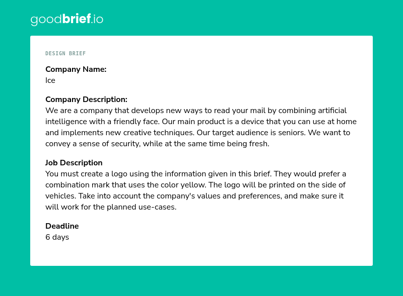
Before settling on the envelope, I explored other symbols of mail, including mailboxes and stamps. These options carried meaning, but they felt too traditional or complex for the playful, senior friendly brand I envisioned. I wanted something simple, recognizable, and welcoming.
The envelope became the perfect choice: it’s instantly understood, and when paired with a cheerful face, it communicates friendliness and clarity. I chose a bright yellow to complement the brand, ensuring the logo feels warm, approachable, and highly visible across both digital and physical applications.
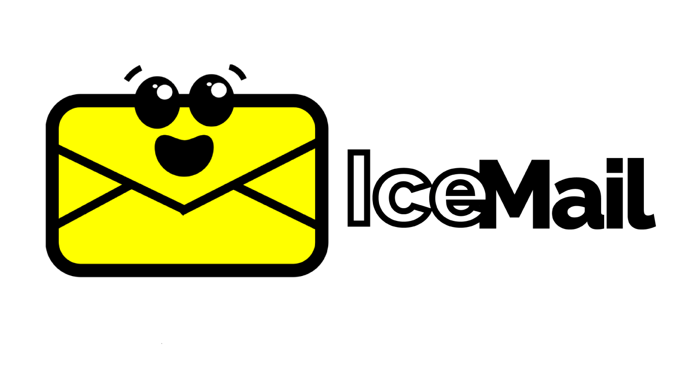
My IceMail logo shows a bright yellow envelope with a friendly face, a symbol of clarity and warmth. Its bold outlines and cheerful expression make mail feel approachable, while the playful design reflects the joy of turning something ordinary into something magical. The Raleway typeface adds a modern, welcoming personality that balances trust with friendliness.
For real world branding, the logo is designed to scale cleanly on vehicles and signage. The bright yellow envelope stands out against white backgrounds, like vehicles, while the bold black text ensures readability from a distance. Using high-contrast colors and simple shapes makes the design effective for decals, print materials, and digital platforms alike.
IceMail helps you understand mail at home using secure, simple technology designed for seniors.
Set the letter under the gentle light. Big guides help you position it.
IceMail scans your letters securely and shows large, clear text on the screen.
IceMail reads aloud or displays the key points in plain language.
Use IceMail at home without sign-ups.
You control what information is saved.
Keeps your mail private and secure.
IceMail makes my mail simple. I press one button and it explains it to me.
The big text and voice are perfect. I feel safer opening letters now.
(800) 555‑0123
Weekdays 9am–6pm
hello@ice-mail.com
We reply within one business day